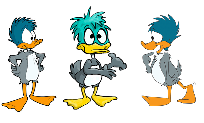
This “Ducky” character has gone through several redesigns, originally drawn as a short little green and gray duck with giant white circles for eyes and a little purple witch hat for clothes. Ducky changed over time, at one point losing the green head in favor of an all-gray appearance, with the addition of mouse ears (that was DuckyMouse, the character who currently occupies my shoulder blade).
Eventually, the mouse ears were dropped, and the green head came back, but without the saucer eyes. Ducky’s eyes remained large and close together, but were no longer circular. The head color changed to a more greenish blue (dark teal?) and the head feathers were ruffled out to look more like a wild and shaggy “hairstyle.” Ducky was also given a white tummy, something the ducks over at Warner Bros. never had.
Over time, the colors have gradually changed, adding more blue to the head color and darkening the orange. Ducky’s body shape was changed to look less like the cartoon duck standard, instead becoming more round with a little belly. However, even after all of these changes, people continue to mistake Ducky for Plucky (the last case of mistaken identity was when an associate of my cried out “Ermahgerd! TINY TOONS!” after seeing one of my comics). So I figured it was time for another change, maybe something a little more drastic.
I am once again attempting to redesign Ducky, but this time I have to try to remove any remaining similarities without completely changing the look of the character. This means avoiding the Warner style while still trying to keep Ducky’s other features mostly intact. I tried to really strip down the character and go with a very basic design, but the character’s personality was completely lost. So I slowly started adding more detail, trying to pull from various styles (since my “personal style” is still very Warner-y) in order to give the character a more unique look.
This is the result of a few hours of doodling. It is by no means a final design, but I think I might be a little closer to helping Ducky shake Acme Acres once and for all.
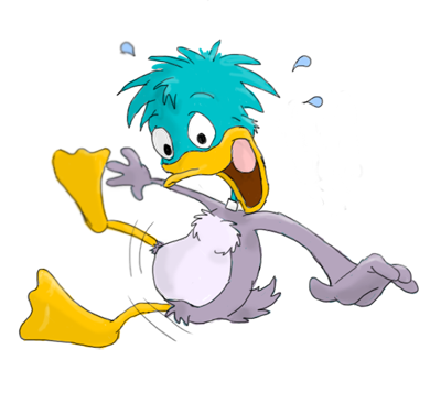
And here is the latest one, possibly looking a little too Disney:


2 thoughts on “Redesigning Ducky 2013-May-5”
Nikki (Ribnose)
Can I just say, that I’ve known you for several years and I really can’t remember when I’ve seen you so ‘alive’ about art? It makes my heart swell to see you writing bits like this, analyzing your own creative process. You are so -obviously- an artist at heart. I’m so happy you’re pursuing your dream <3 <3 <3
Nikkiface/Fah <3
Ducky
Thank you, Fah! Xoxo
Also On